
What I do: Practical Data Visualization
I’m often ask what it is I do for a living… and being lazy I usually just say ‘computer stuff’. In an effort to provide a little more context to anyone who may be interested this is one in a series of postings where I’ll cover some aspect of what it is I do.
In my current role I spend part of the time doing development projects. (aka programming) I’m not a hard core developer though.. it’s not my full time occupation nor do I want it to be. I work mostly with perl and php when necessary, mysql and occasionally PostgreSQL or Oracle all under various flavors of linux. (debian is my favorite). Usually these development tasks are related to some sort of management automation for a global VoIP network but sometimes they involve making complex things easier to understand. Part of that involves automating the collection of large amounts of data and then presenting in a meaningful way so that problems and long term trends can be identified. What follows are some examples of the sorts of things I mean.
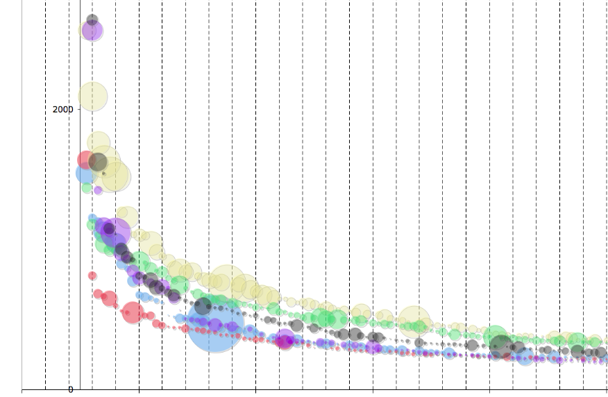
I was once tasked with redistributing users on a farm of several large mail servers to better balance performance. This meant I needed to quantify how much impact each user (or group of users in this case) was having on the system in order to come up with a plan to fix the imbalances. This was not an easy task as there was no way to get direct measurements of that sort of thing. So.. operating on a ‘best effort’ approach I wrote some code to scour the mail server logs going back several weeks and gather stats on the number of messages sent/received, size of said messages, combined size of the mail store for the groups of customers etc. I was then able to plot this info in different ways and figure out who the heavy hitters were. There were some surprises.. as some had little saved on the server but moved a ton of bytes through the system.
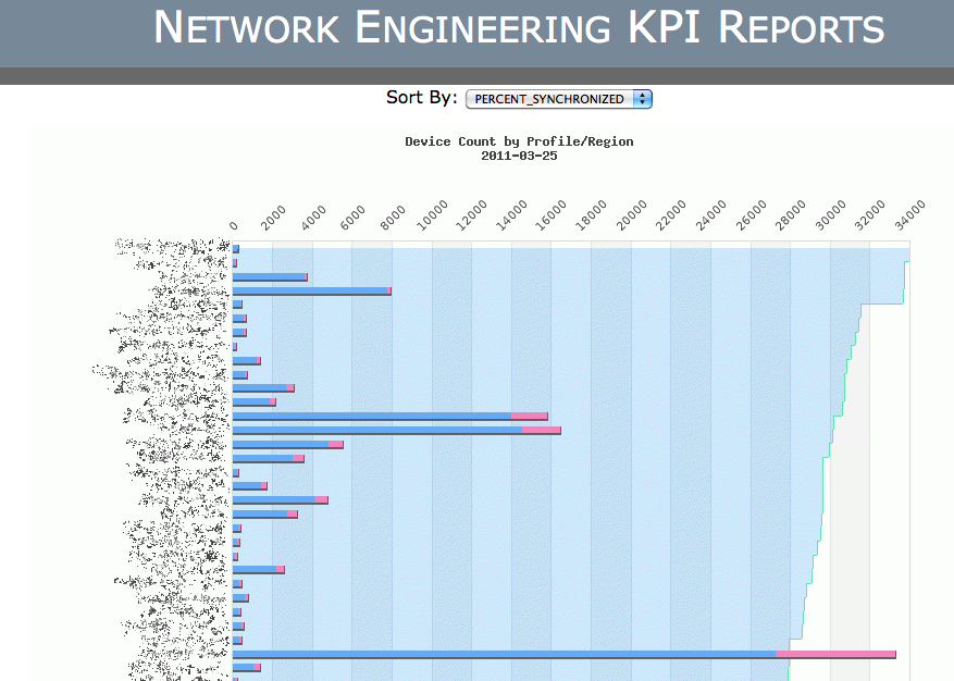
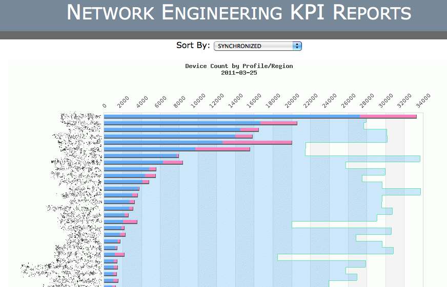
Another project called for the automation of several reports that upper management wanted to see from our engineering group. Unlike say sales or marketing.. it can be difficult to quantify the things we do in any sort of meaningful way. I was able to pull together lots of reporting data though on operational aspects of the network and the customer devices we have in the field. To make this as hands off (for us) as possible I wrote a database backed template system that allowed those on the top floor to choose from a range of reports with custom date ranges and generate either downloadable spreadsheets or in some cases fancy dynamic graphs. These example images show the same data set sorted different ways for a certain point in time and were created with the JpGraph php library. These graphs can also be combined to show a running animation of how things change over a period of months or years. This was the front end for data that was collected from several different (and incompatible) systems and distilled down to reports that anyone could make sense of.
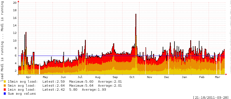
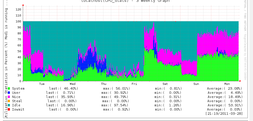
One of my primary tasks in my current role is to build and run the network monitoring system. This is done with all open source software that is very powerful and very flexible. I’m constantly developing new aspects of the system to customize it to the needs of a growing VoIP carrier network. These are two examples of the sorts of server level stats we collect on nearly all the systems being monitored. The first is a long term trend plot of a system load. The second is a weekly plot of what the CPU was spending time on. This sort of information is great for forensic troubleshooting (ie root cause analysis) and for capacity planning. In addition to CPU usage we also track memory usage, process counts, service response times, bandwidth usage, database query performance, and the network BGP mesh status. Some stats are just trended some are trended with threshold alarms including some rate of change alarms that are very responsive to service problems.
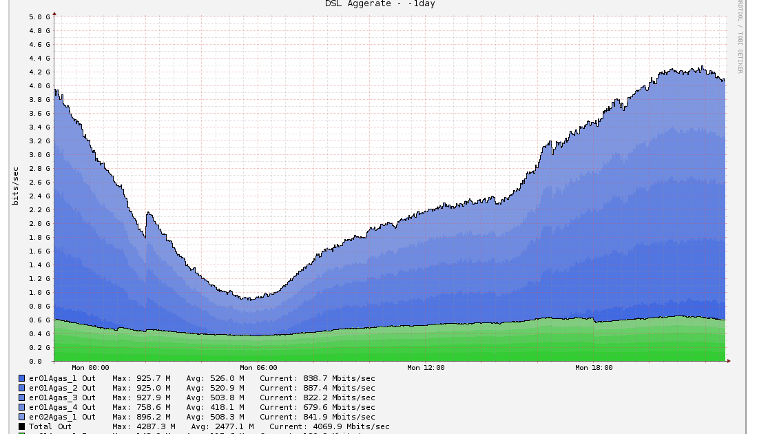
{% img left /pics/inline_datavis11.png %} This last example is the most recent. In addition to telecom the company also deals with a small but growing number of DSL customers which require us to manage and maintain the backend network that connects these users to the internet. Without getting too technical.. the backend router has several gigabit circuits from the ‘last mile’ provider that converge into a set of redundant routers in our CoLo. Over time.. these feeder circuits can become imbalanced and blocks of users must be moved to other circuits. We also need to keep track of overall circuit usage so we know when more circuits (which are quite expensive) will be needed. So.. tactically we need to know what’s happening on the circuits in a very high resolution view tracking both peaks of individual circuits and aggregate bandwidth and strategically we need to know if those peaks are trending up or down over a period of months. This info along with active customer counts and average usage-per-customer can be relayed back to sales for their trending and pricing. Since this is new I don’t have a useful peaks graph yet.. but this is an idea of the tactical data referenced for circuit balancing and circuit addition. This data is collected with snmp in 1 minute increments and stored in an RRD database that is setup to keep two sets of data for this trending. One dataset contains every 1 minute sample for a period of 7 days. As the data ages beyond 7 days it flows into the second set. It examines a 24 hour period and stores only the peak values for that day and those data points are saved for 5 years for long term trending.