
Scary Charts
I don’t often write about stocks or the economy.. it’s just too difficult to know anything with any certainty anymore. We’ve been kicking this can down the road far longer than I thought would be possible at this point but a quick look around the world and you are seeing the wheels start to come off. Here are a few scary charts that when combined with the news coming out of Europe and Japan spell trouble.
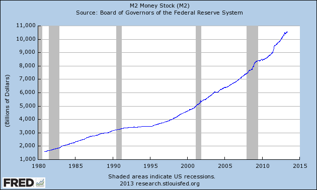
The M2 money supply… if you don’t know what this is wikipedia has a writeup on it.
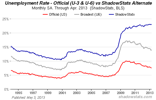
The real unemployment rate… not that number GovCo reports every month.
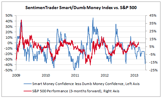
And as for the market… I don’t trust it one bit. It’s not real… it’s a fabrication and fully owned enterprise of helicopter Ben Bernanke. This isn’t just me… here’s the smart vs dumb money chart. The smart money is getting out while the ‘retail investor’ is piling in.
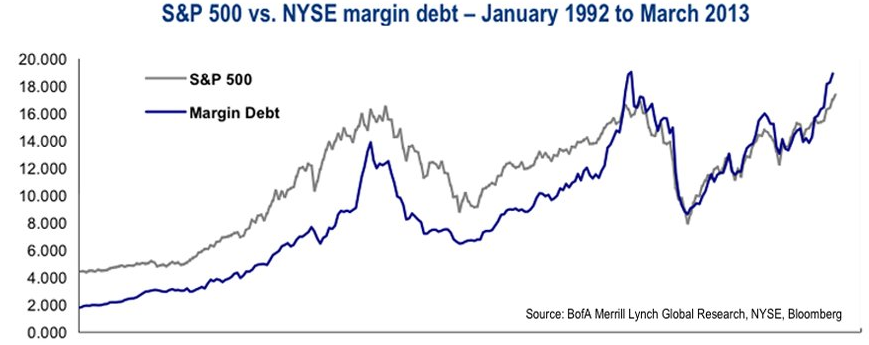
More evidence of the same… the number of people playing the market with borrowed money is peaking again.