Economy

Scary Charts

I don’t often write about stocks or the economy.. it’s just too difficult to know anything with any certainty anymore. We’ve been kicking this can down the road far longer than I thought would be possible at this point but a quick look around the world and you are seeing the wheels start to come off. Here are a few scary charts that when combined with the news coming out of Europe and Japan spell trouble.

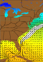
Spill Impact Measured in Trillions?

Reading more about the spill over the weekend.. the situation looks much worse than it did on friday. The visible surface area of the spill has grown much faster over the last few days than it should have if it were leaking at the rate of 5k barrels a day.  The fear is that the piping will totally open up and release on the order of 165 – 250k barrels a day making it a bigger spill than the Valdez in as little as a couple days.  Worse.. there is a pretty good chance  at this point that the oil is going to migrate east and get caught up in the [gulf stream][2] which will carry it around to the east coast of Florida and potentially as far as NC affecting roughly half the east coast.